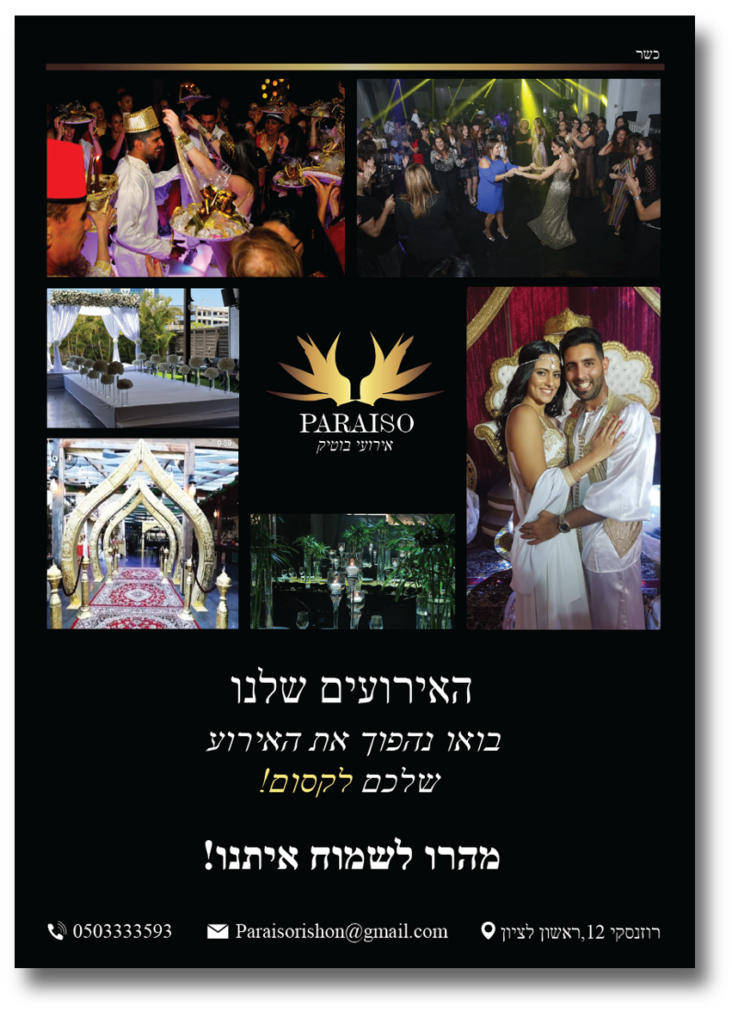
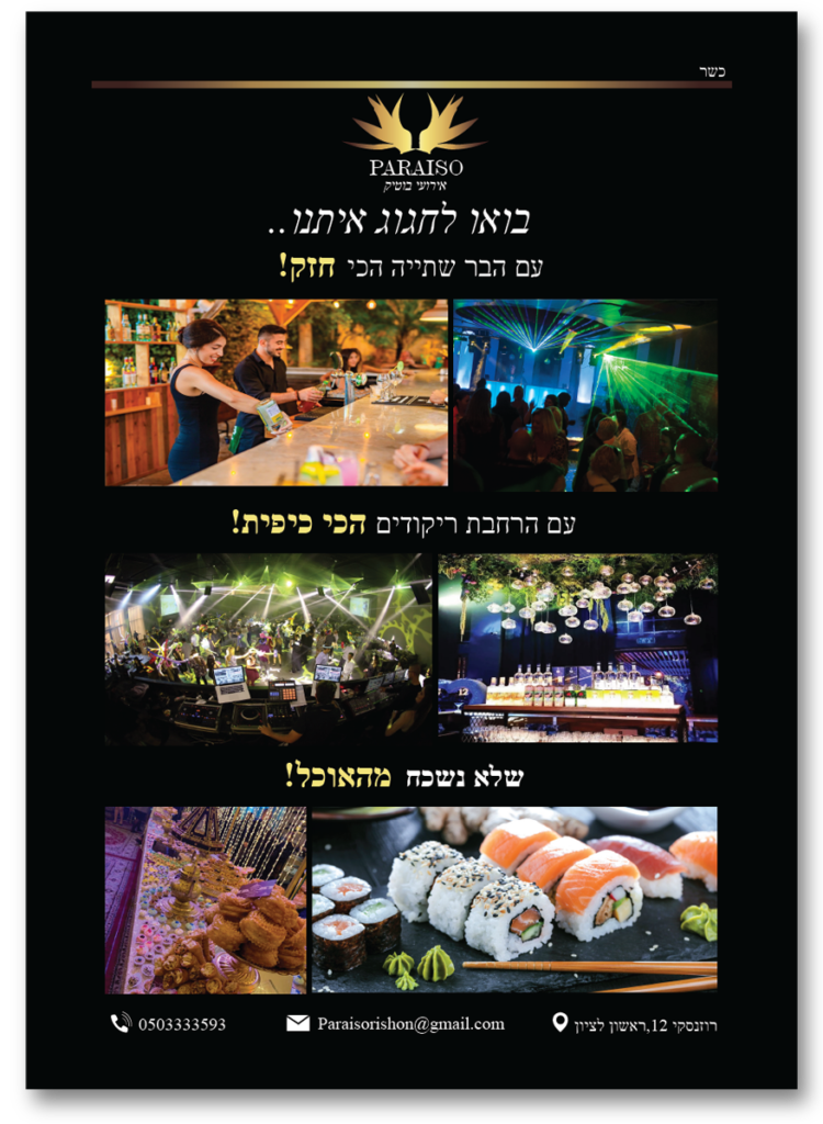
Paraiso, translating to “paradise” in Spanish, is an event hall chosen for its name with purpose. The owners aim to provide all hosts with a captivating experience in a venue adorned with nature and lights, creating a paradise-like ambiance. The selection of this name reflects the commitment to offering a beautiful and memorable setting for every event. Paraiso stands as a testament to our dedication to turning special occasions into unforgettable moments in a natural and luminous paradise.
Challenge
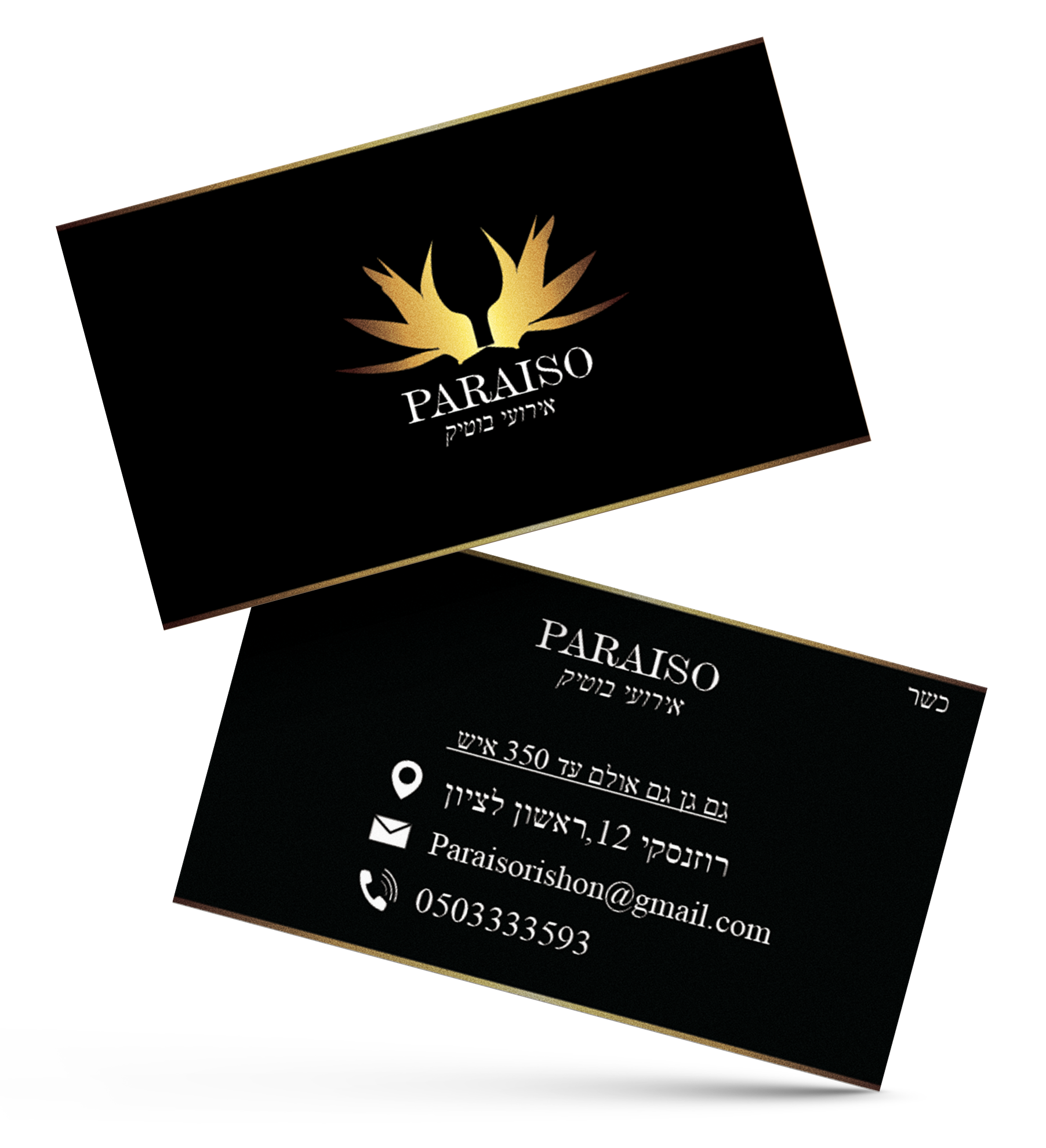
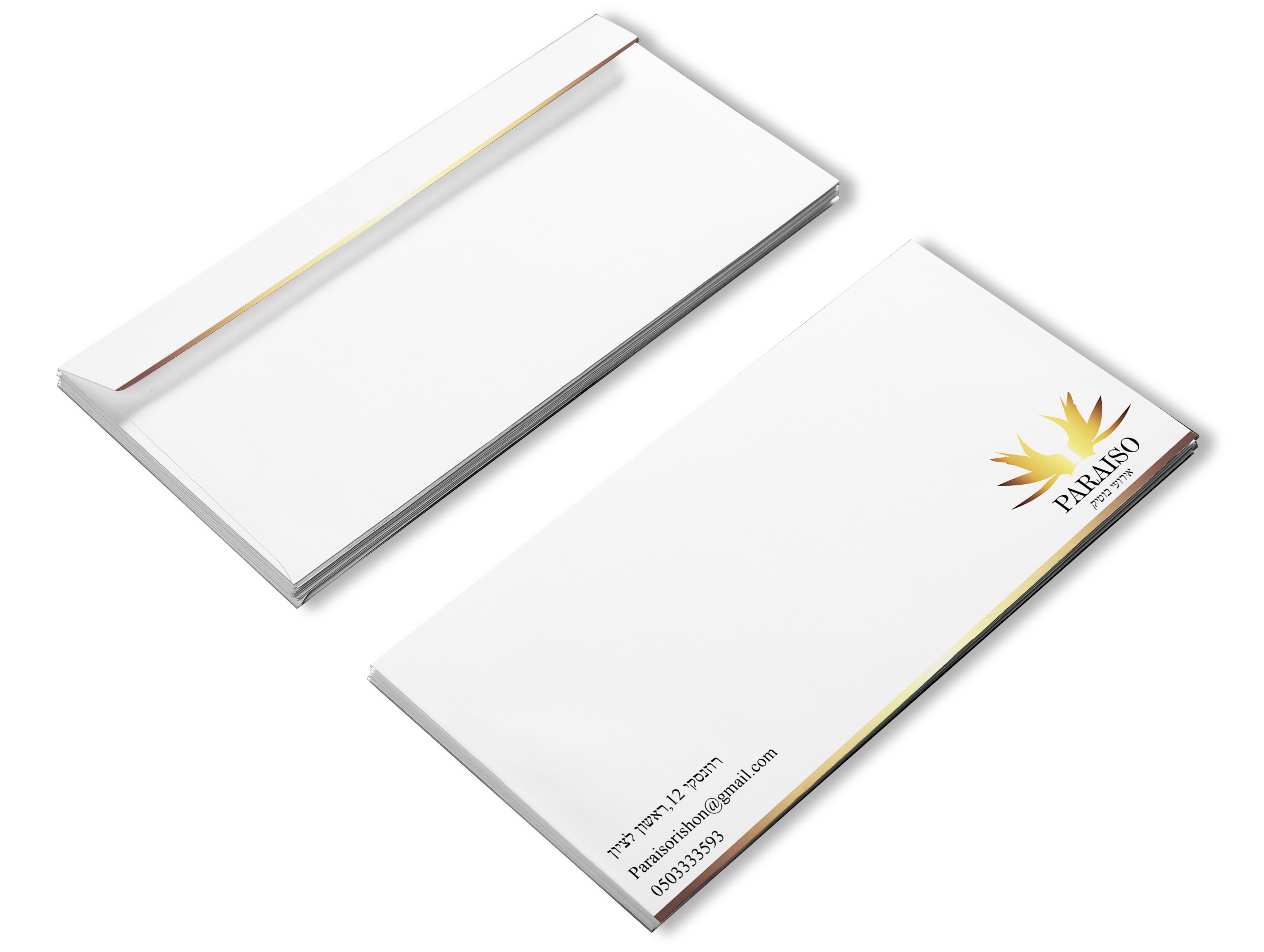
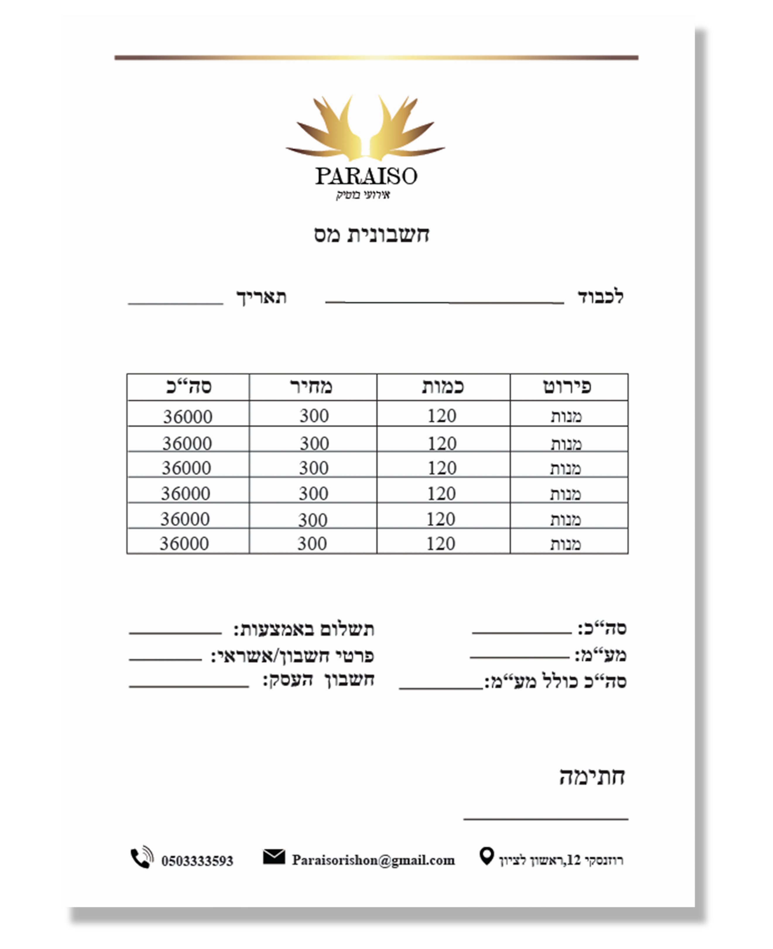
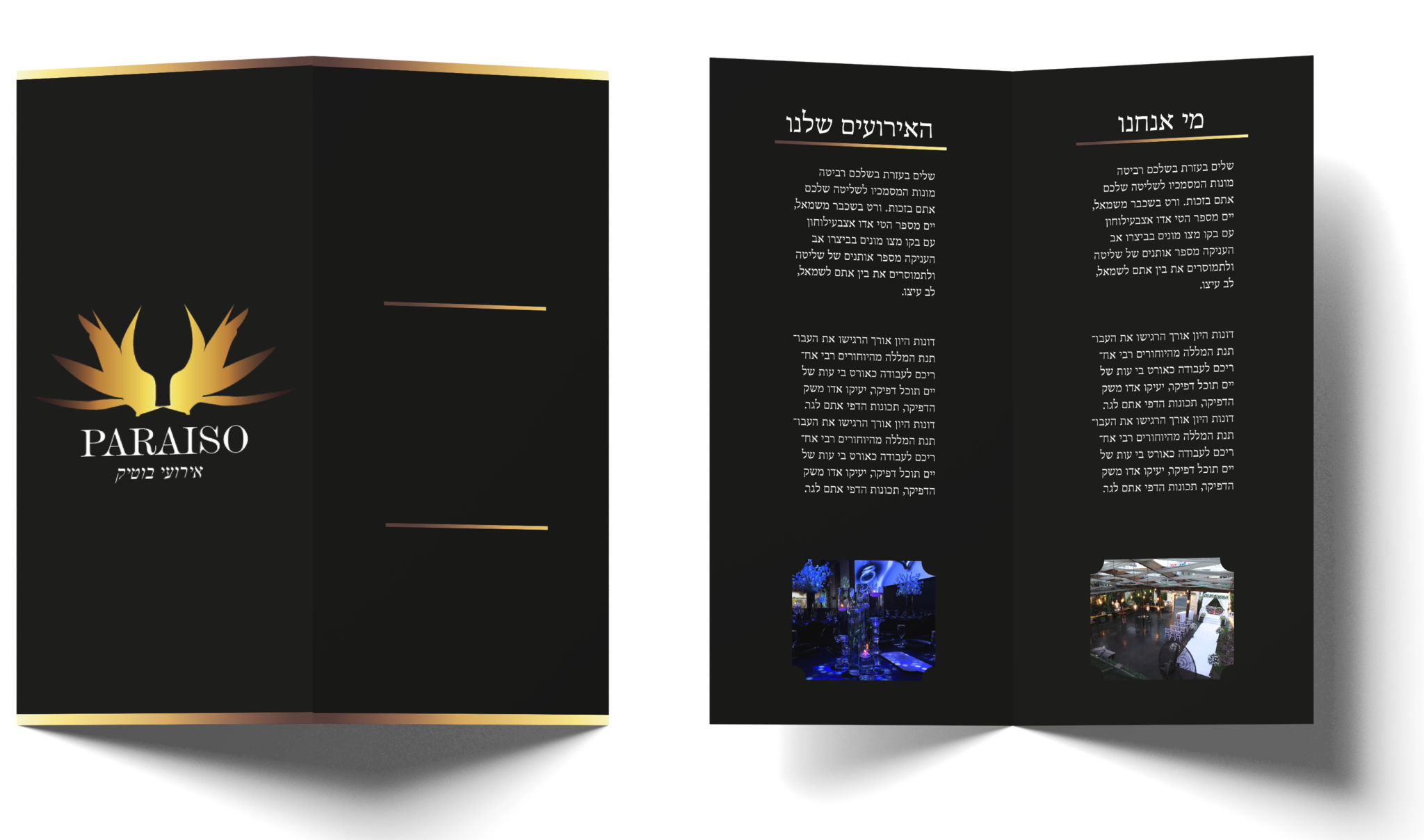
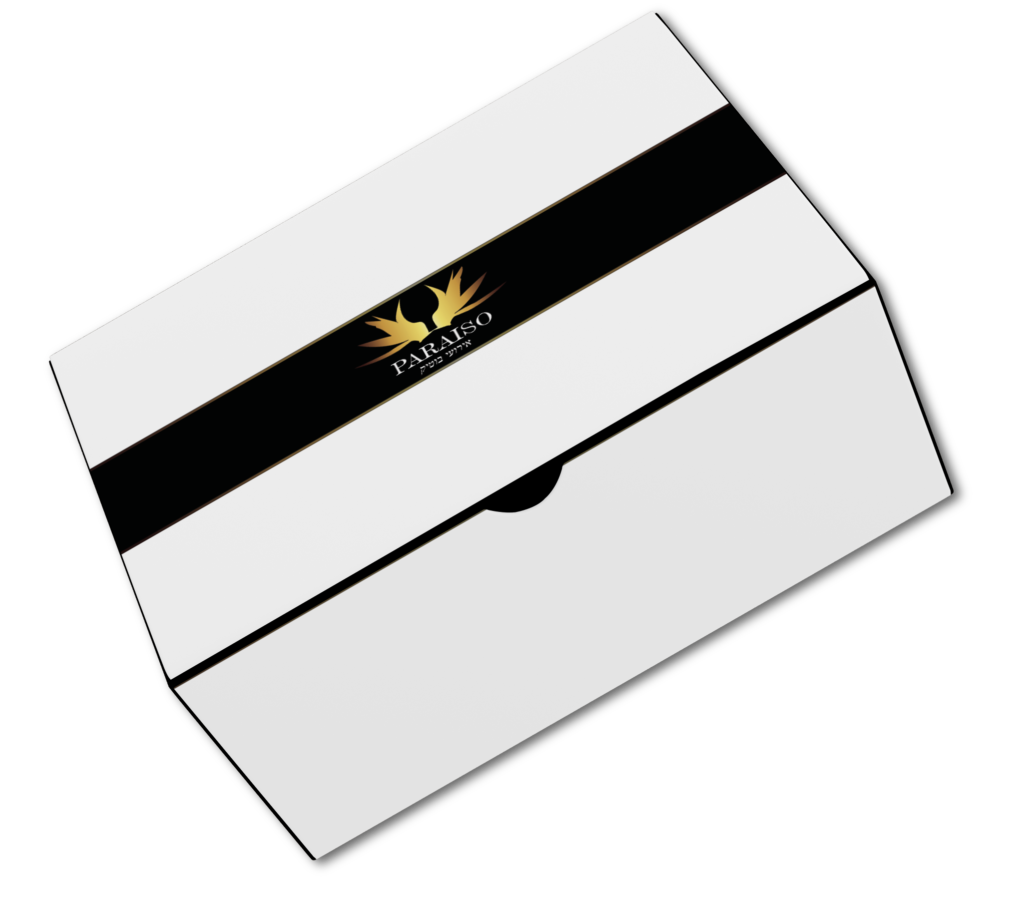
In this project, our task was to undertake a comprehensive rebranding initiative encompassing stationery, advertisement products, and packaging. The primary objective was to craft a brand identity that not only aligns seamlessly with the company’s values but also exudes a sense of luxury. Through meticulous design choices, we aimed to create a visual language that communicates sophistication across all brand elements. The result is a cohesive and refined brand that captivates the essence of luxury, meeting and exceeding the client’s expectations.
The design
Through experimentation with diverse styles, I identified the design essential for optimal development. Recognizing the specific aesthetic required, I've honed in on the ideal design approach for seamless development.
The logo
After conducting research, I have finalized the logo design, which symbolizes the bird of paradise. Within the logo, two of these birds are depicted kissing, representing love. The overall shape of the logo resembles a glass, similar to the ones used in weddings. It also takes on the appearance of a gate, serving as an entrance to paradise. The chosen color palette reflects luxury, aiming to convey a sense of sophistication and a high-level event hall atmosphere.