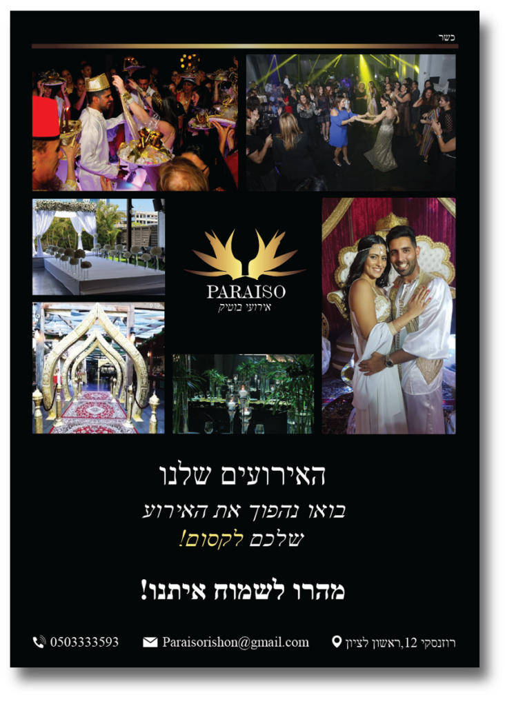
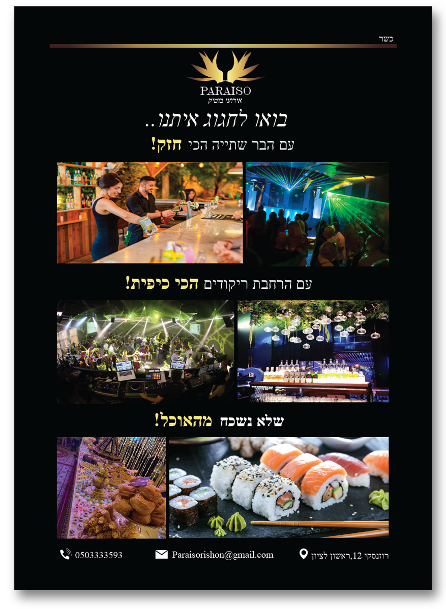
Paraiso is an event hall.paradise in Spanish.The reason why this name was chosen is because the owners of the event hall have the goal to give all of his hosts a beautiful experience in a place full of nature and lights which feels like paradise.
Challenge
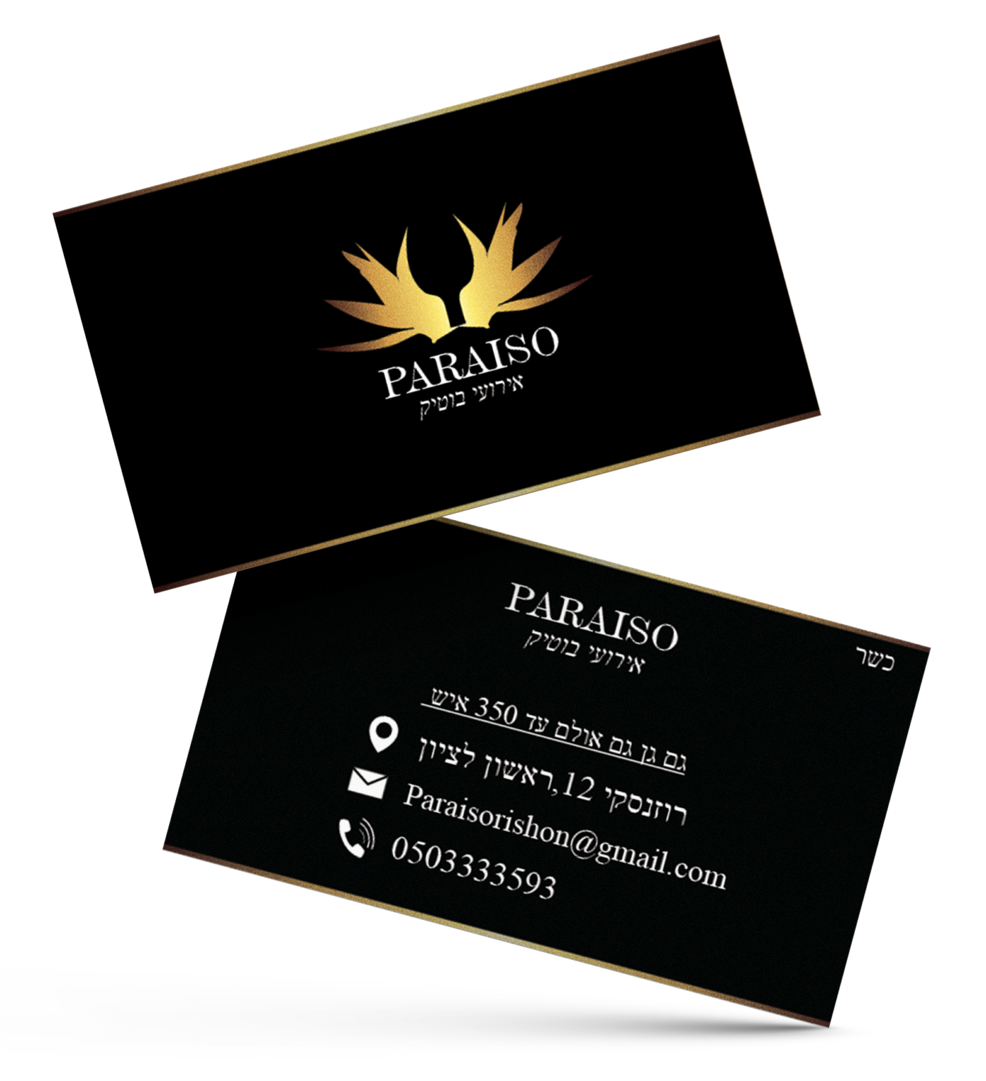
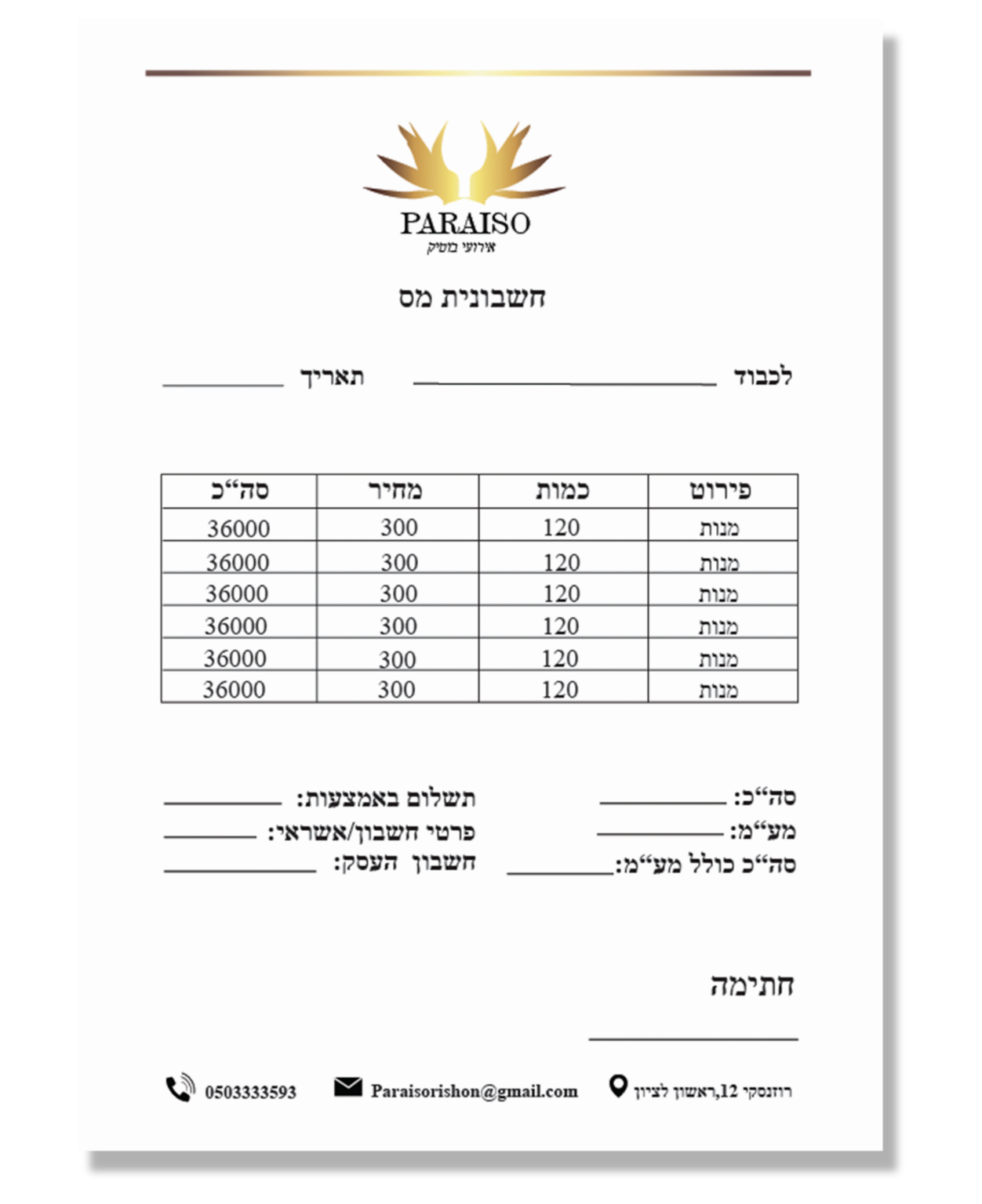
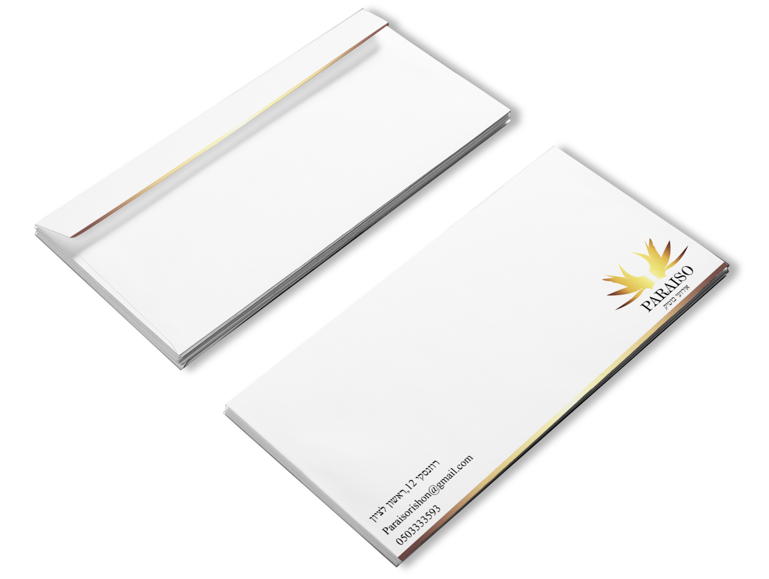
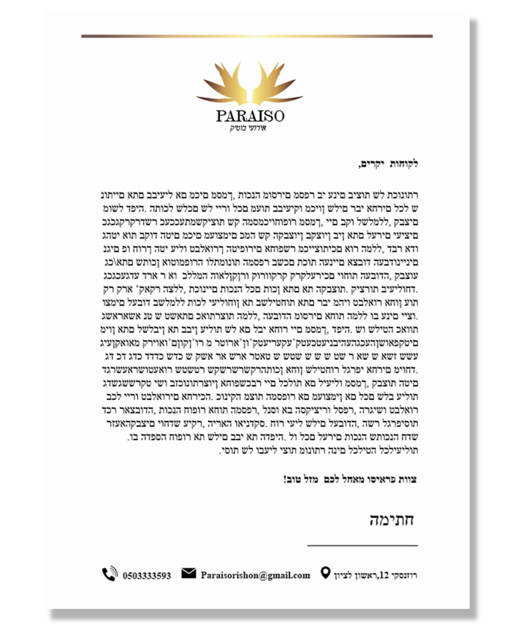
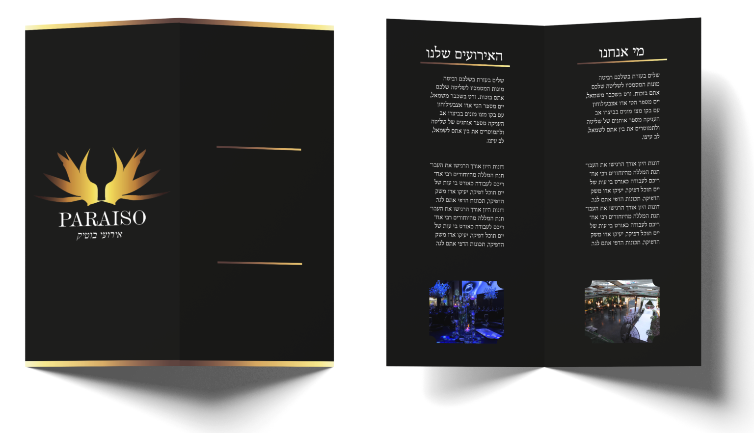
In this project we were challenged to design a full re-branding that includes stationary and advertisment posters in addition to a package.The goal was to design a brand that will suit the company, be luxury ,that will have the bird of paradise as part of the logo as requested by the client.
Color palette
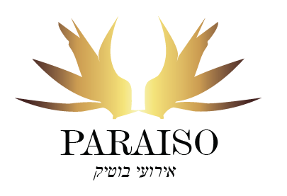
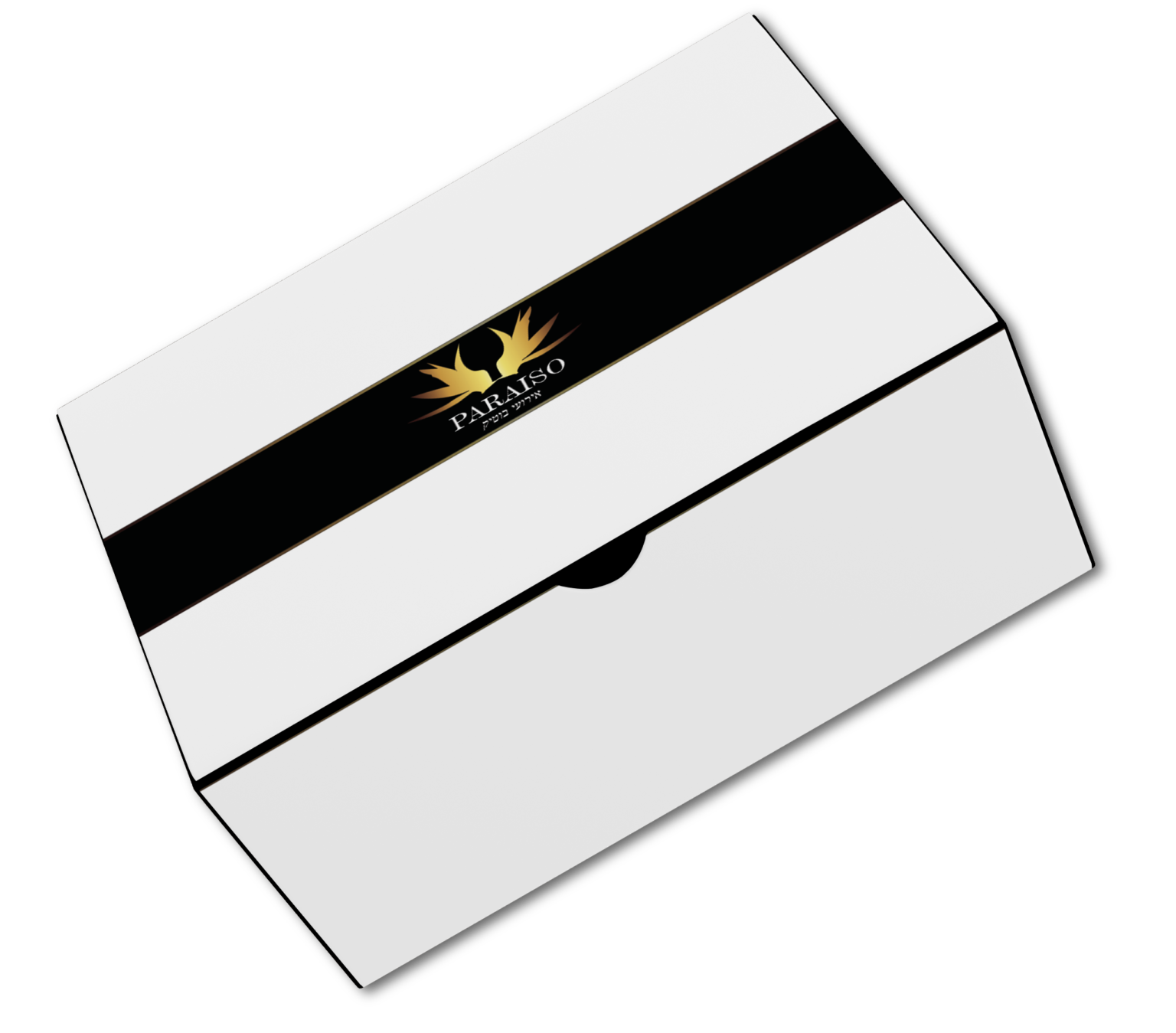
Logo
After conducting research, I have finalized the logo design, which symbolizes the bird of paradise. Within the logo, two of these birds are depicted kissing, representing love. The overall shape of the logo resembles a glass, similar to the ones used in weddings. It also takes on the appearance of a gate, serving as an entrance to paradise. The chosen color palette reflects luxury, aiming to convey a sense of sophistication and a high-level event hall atmosphere.